The Ultimate Guide to Framing Art – Tips to Make Your Wall Art Shine
If you’re looking to give your art the perfect finishing touch, you’re in the right place! Framing artwork is more than just putting a border around it; it’s about elevating the art and creating a harmonious flow between the piece and the room it lives in. At Fightsong Studio, we believe each artwork deserves a frame that supports its story, not one that steals the show. Ready to learn the best tips to make your art shine? Let’s dive in!
Why Framing Matters – The Magic of a Well-Chosen Frame
Imagine going to a special event without your favorite shoes or necklace. It’s just not the same, right? Framing is like accessorizing—it completes the look! A frame protects your artwork and enhances its beauty, making it feel like a seamless part of your space. When done right, framing turns your wall art into a masterpiece, blending style and function beautifully. Here at Fightsong Studio, we’re all about framing that serves the art, amplifying its message without overpowering it.
The Biggest Rule of Framing Artwork
Your art should always be the star, and the frame should be its biggest supporter. Think of the frame as the art’s cheerleader, helping it look its best while taking a back seat. At Fightsong Studio, we’re passionate about creating pieces that take center stage, and framing is the backstage crew making sure everything is in place!
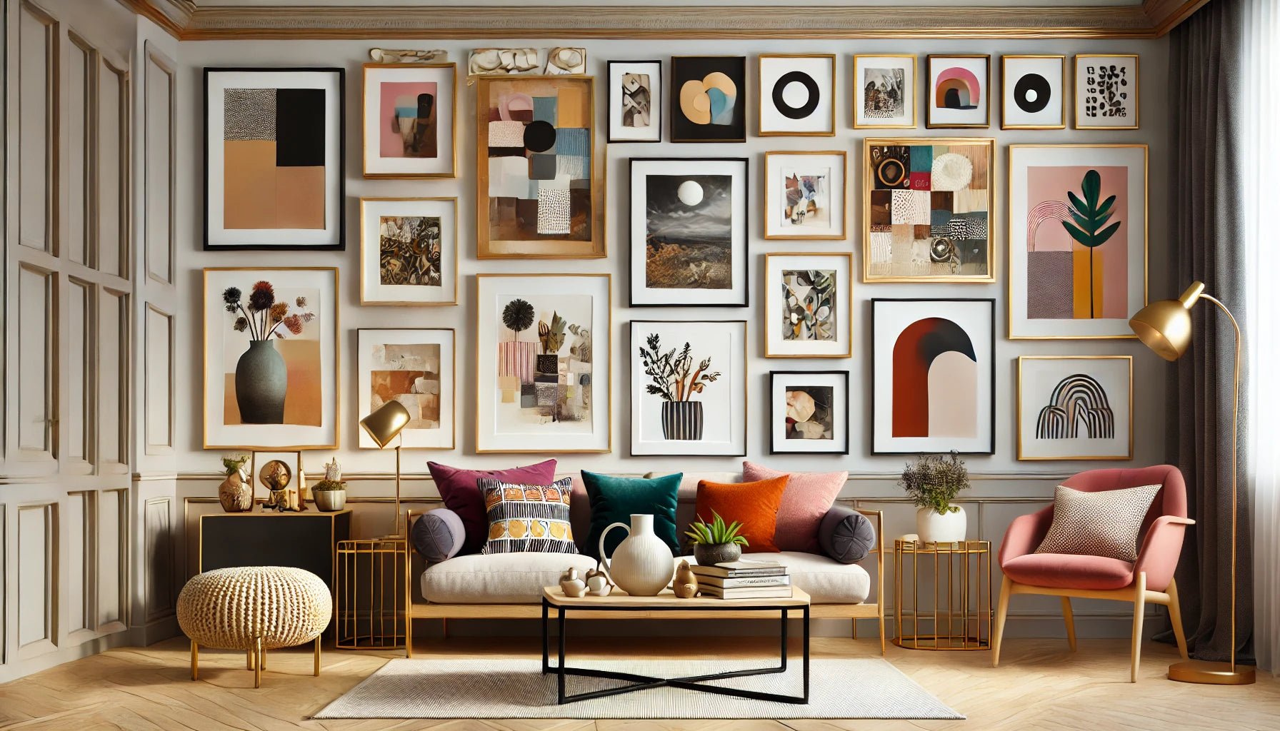
Frames Should Complement, Not Compete
When choosing a frame, ask yourself: does this make the art stand out? The frame should support the colors, style, and mood of the art without competing with it. Simple frames often work wonders for modern, clean displays, while ornate frames might suit vintage or classical styles better.
Aligning Your Art with the Room’s Style
If your room has a minimal, modern feel, a sleek black frame may be all you need. For more traditional or eclectic spaces, a rich wood frame might work better. The idea is to let the art speak for itself while the frame subtly helps it blend with your decor.
Essential Tips for Framing Art
Now let’s get into the nitty-gritty with some framing tips that make your artwork stand out and stay protected.
1. Depth and Width – Size Matters!
Does your art call for a chunky, bold frame, or would a slim, elegant frame do the trick? Frame depth and width impact how the art feels in its space. For example, thicker frames can add weight and presence, while thinner frames keep it light and minimalist. At Fightsong Studio, we lean toward frames that add substance without overshadowing the art. Check out our many options of framed and unframed wall art prints.

2. Materials Matter – Wood, Metal, or Frameless?
Wood frames bring warmth and texture, metal frames feel sleek and modern, and “invisible” frames keep all focus on the art. Consider your room’s style and choose a material that complements both the artwork and your decor. Each material has its charm, so don’t be afraid to experiment!
3. Using Negative Space – To Mat or Not to Mat?
Mats are fantastic for creating a “breathing room” around your art. Think of a mat as a mini frame within a frame that lets the artwork have a moment. Mats don’t always have to be white; darker or colored mats can add contrast. If you’re going mat-less, consider built-in negative space (like the 1.5” white border we add to limited editions at Fightsong Studio) or even a wider frame to keep things balanced.
4. Protecting Art with Spacers
Going frameless? Make sure to add spacers to keep your art from touching the glass. Spacers are a thin barrier that prevents the image from sticking to the glass and protects it from moisture and dust. I’ve learned this lesson the hard way, so trust me: spacers save art!
Framing Materials and Glass – Choose Wisely!
Selecting the right material and glass is crucial for both aesthetic and protective purposes. Here’s what to keep in mind:
5. Glass or Acrylic – Protecting the Print
Both glass and acrylic protect from dust, fingerprints, and sunlight. For high-value or archival-quality pieces, go for UV-protective, non-glare glass. This is especially important for pieces like our limited edition prints at Fightsong Studio, where you want the colors and details to last a lifetime.
6. Avoiding Glare for Perfect Visibility
There’s nothing sadder than beautiful art hidden behind a sheet of glare. If your art is displayed in a bright room or near windows, consider non-glare glass. Test it out in different lighting before finalizing; after all, you want the art to be admired, not dodged!
Best Framing Tips to Preserve and Display Your Art Beautifully
Proper framing not only makes your art look fabulous but also extends its life. Here are a few more insider tips:
7. Avoid Direct Sunlight
Sunlight can be beautiful, but it’s not kind to art. Try to hang framed art away from direct sunlight to prevent colors from fading. Even high-quality inks and papers, like those used in Fightsong Studio prints, will benefit from this extra care.
8. Measure Twice, Frame Once!
Once your print arrives, measure carefully before buying a frame. Having the right size means less chance of damaging your art or getting a frame that doesn’t fit. A little patience goes a long way in making sure your art is displayed just right!
Resources for Framing Your Art Like a Pro
Framing doesn’t have to be intimidating. While Fightsong Studio can be your go-to framer for our own Limited Edition Gallery Print work, here are some other resources to frame your special art pieces that are dying to grace your walls:
Your Local Framer
Nothing beats the personal touch of a professional framer. Look for a local framer with a great reputation to help you find the perfect frame. Support local businesses while getting expert advice!
Framebridge and Metroframe
Framebridge and Metroframe offer easy online framing options. You can even send in your artwork, and they’ll do the framing for you. Metroframe offers a high-end, custom approach that’s perfect for pieces you want to keep for a lifetime.
Frame It Easy
As the name suggests, Frame It Easy makes it… well, easy! They offer custom frames at affordable prices, perfect for when you need a quick solution with solid quality.
Michaels and Hobby Lobby for DIYers
For those looking to save a little and do it yourself, check out Michaels or Hobby Lobby. Their selection of open frames works well for standard-sized art prints and can be a great, budget-friendly solution.
The Final Step – Let Your Art Shine!
Framing is the last step in making your art feel right at home, so have fun with it. At Fightsong Studio, we believe that every piece you add to your space brings inspiration, color, and joy into your world. Let the art be the hero, and let the frame be its strongest ally.
And one last piece of advice: once you’ve found that perfect frame, hang up your art and let it speak to your soul. Don’t leave it hidden away waiting for “someday”—give it the spotlight it deserves! Art is meant to be enjoyed, to inspire, and to brighten every day.
Use these tips to bring out the best in your Fightsong Studio wall art or any other special pieces you have. And if you need a little extra guidance on framing, feel free to reach out. We’re always here to help you bring your art journey to life!